Wand
Effortless party planning, all in one place.
Project Overview
Project Goals
Develop a one-stop app to simplify party planning
Support hosts who don't have budget to hire event planner
Help users remember essential steps
Simplify collaboration between planners
Manage all documentation and logistics efficiently
User Pain Points
No clear process for learning how to host
Uncertainty about where to start
Overwhelming amount of information to manage
Hosts juggle multiple notepads and apps for budget, agenda, RSVPs, etc.
- Plans and steps often get lost or forgotten
Problem Solutions
Remembering Steps
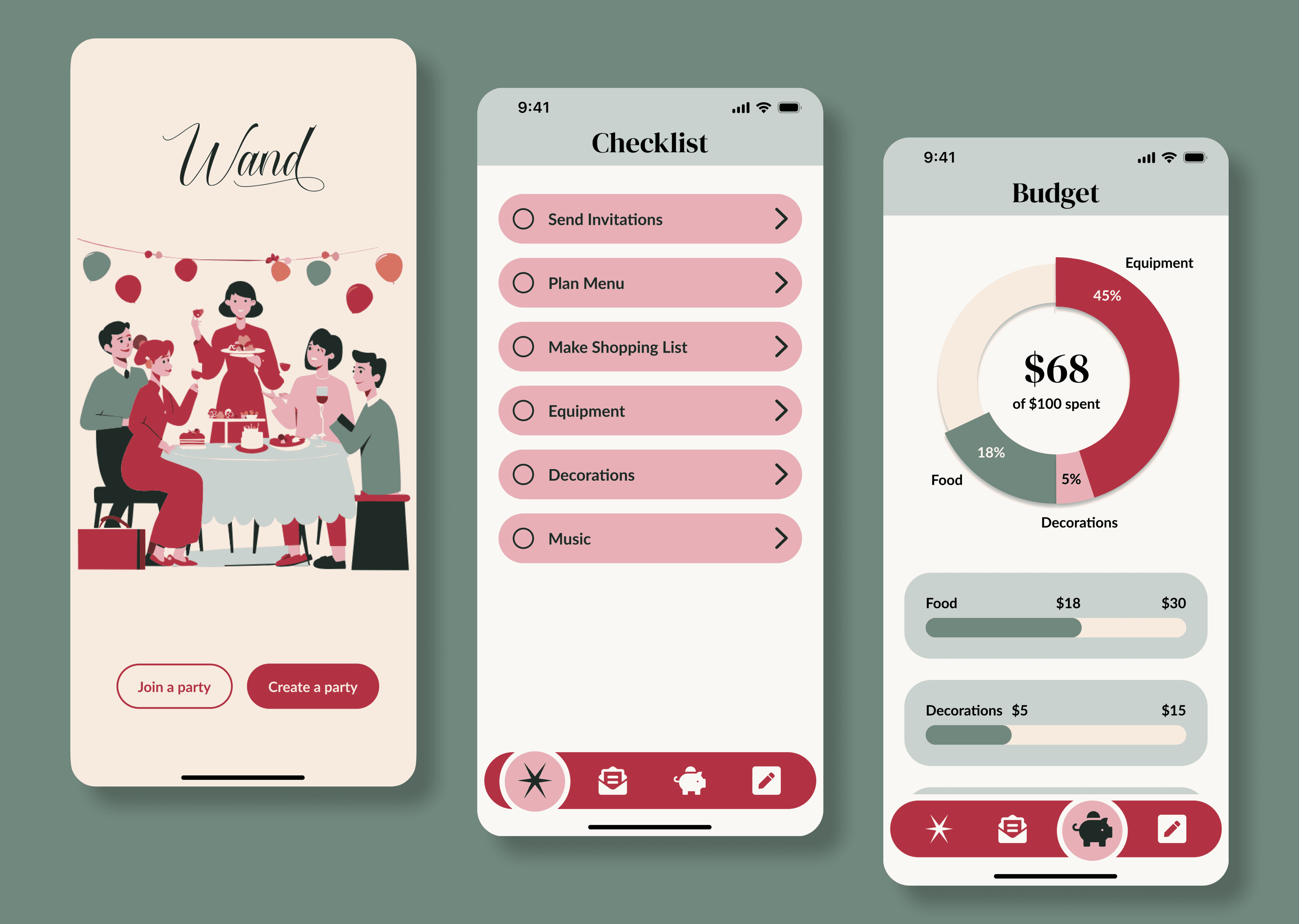
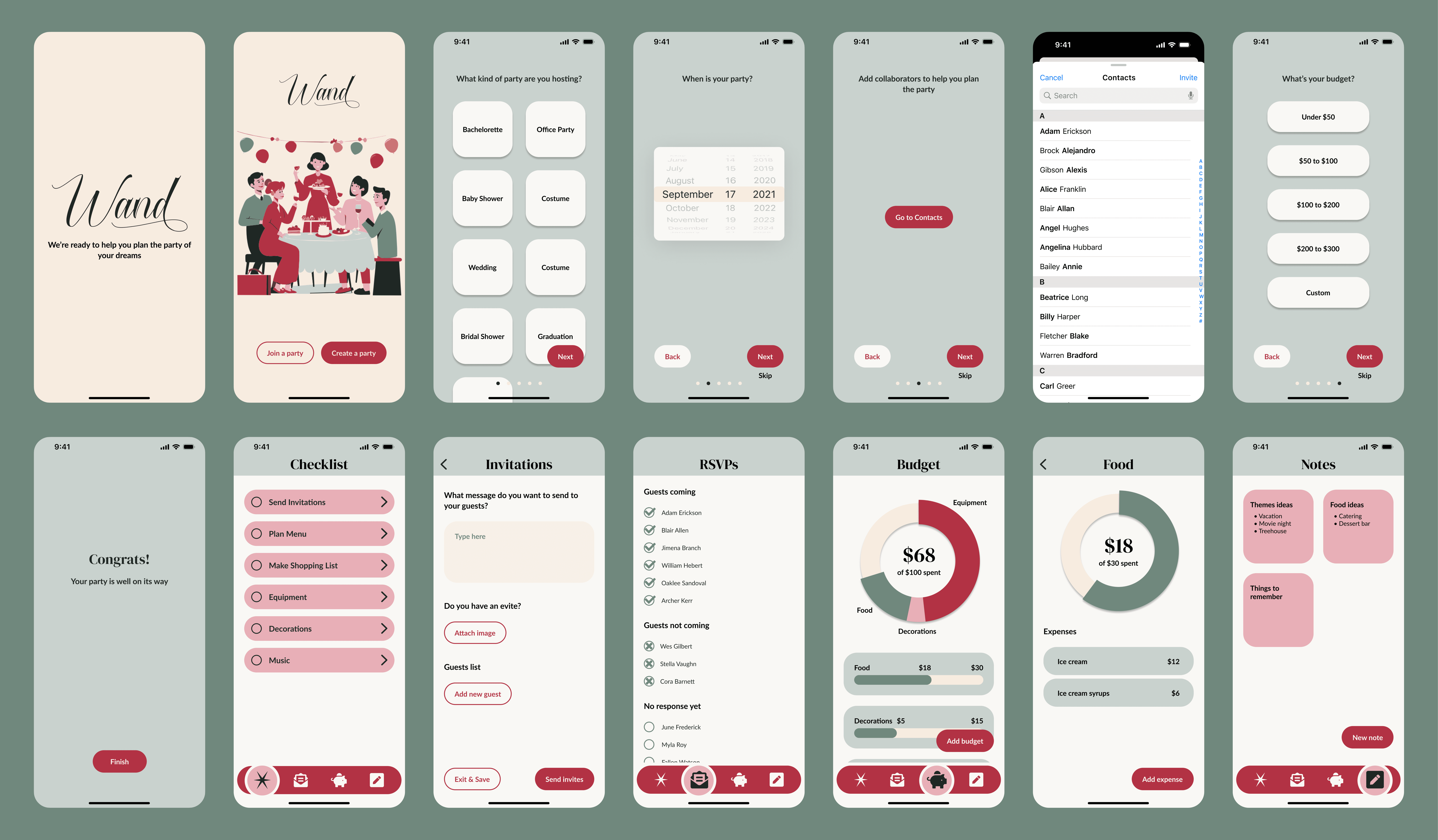
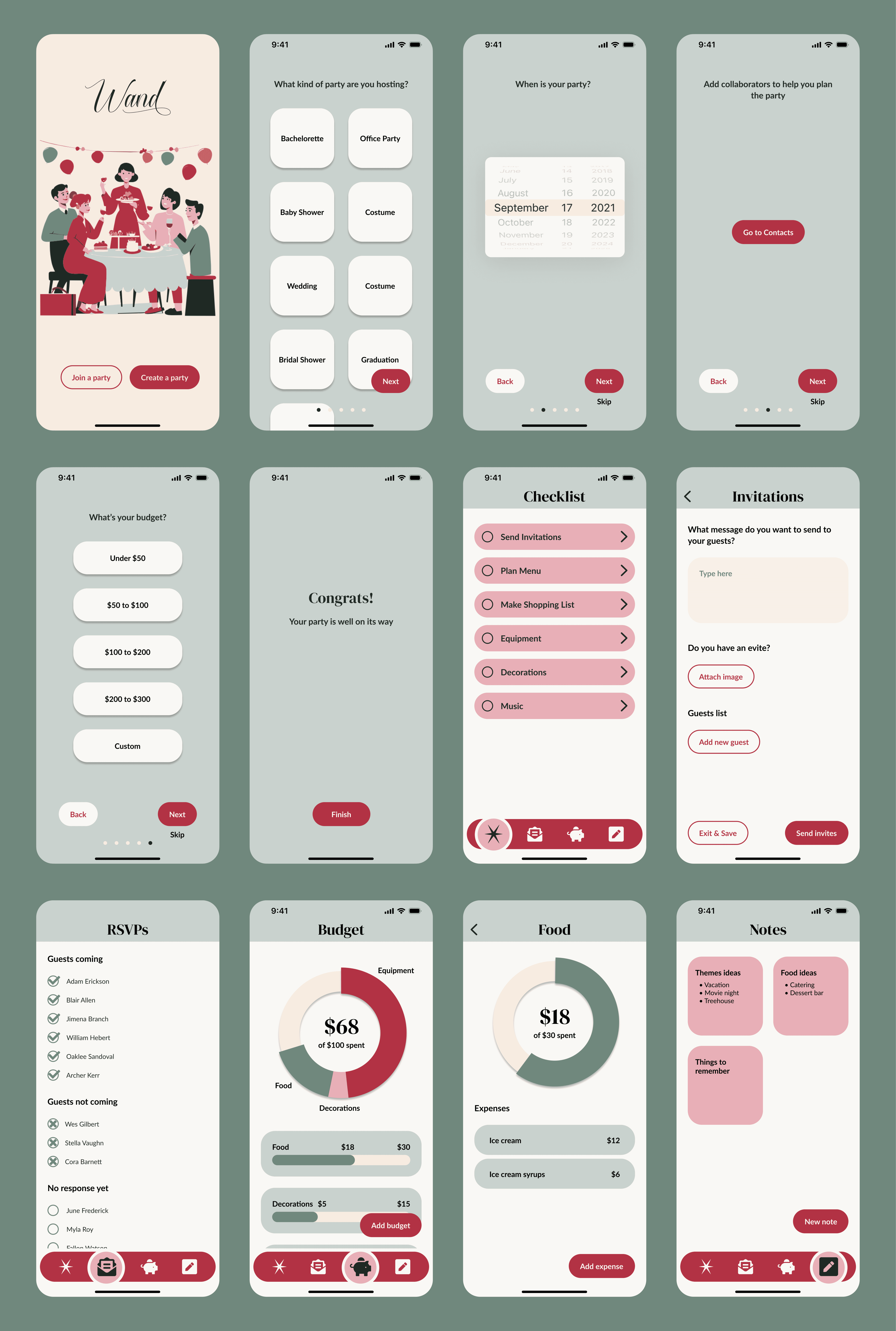
A major concern for inexperienced party planners is knowing what to include and keeping track of everything. To assist these users, I created a detailed checklist on the app homepage, which is customized based on the type of party selected during onboarding.
Simplify Collaboration
As parties are often planned by multiple people, I ensured the app includes a feature for co-hosts to communicate and stay aligned.
Manage Documentation and Logistics
Managing changing logistical details like budget and RSVPs can be challenging. The app centralizes these tasks to simplify the process and ensure no information is lost.
Defining the Problem
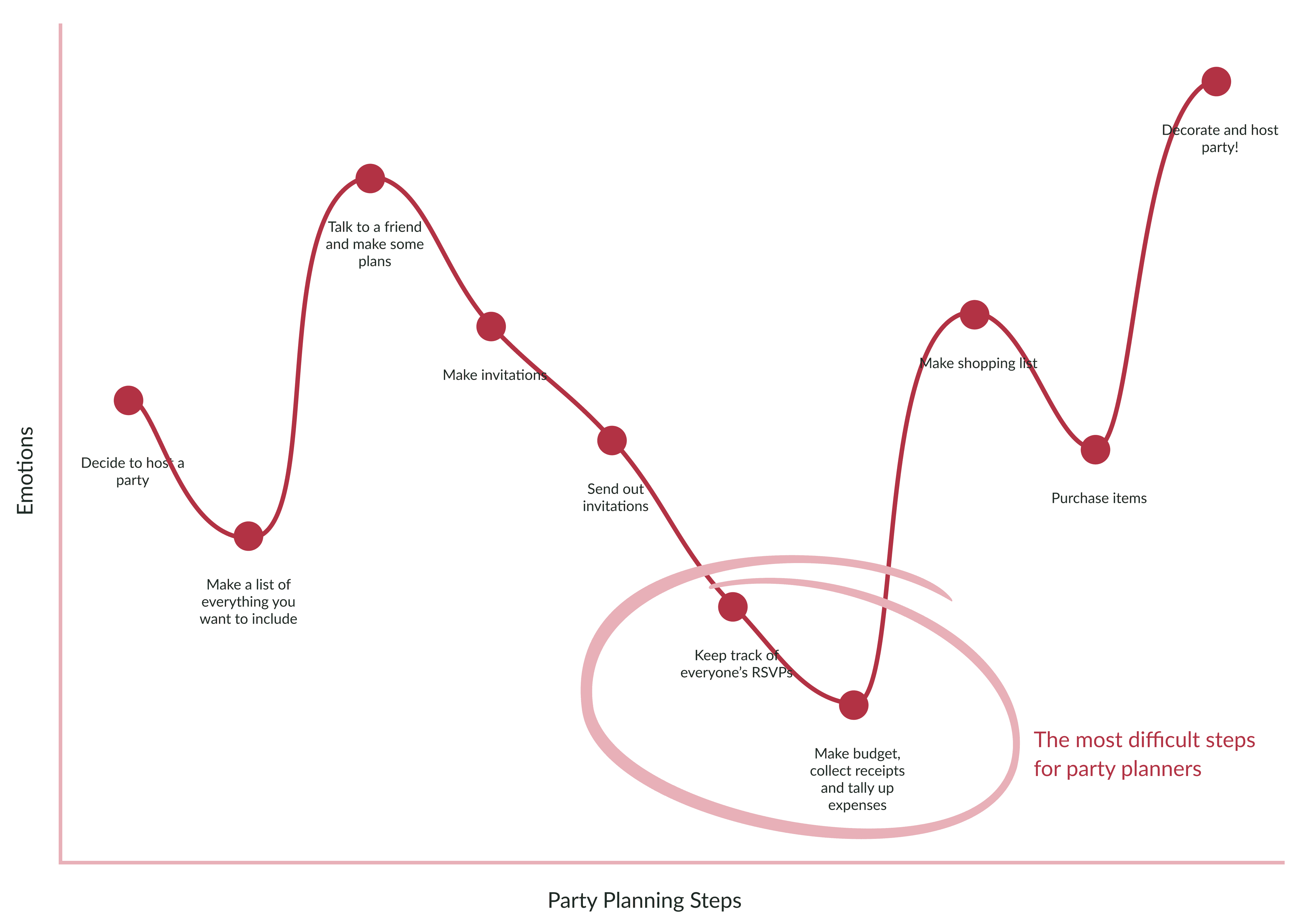
Emotional Journey Map
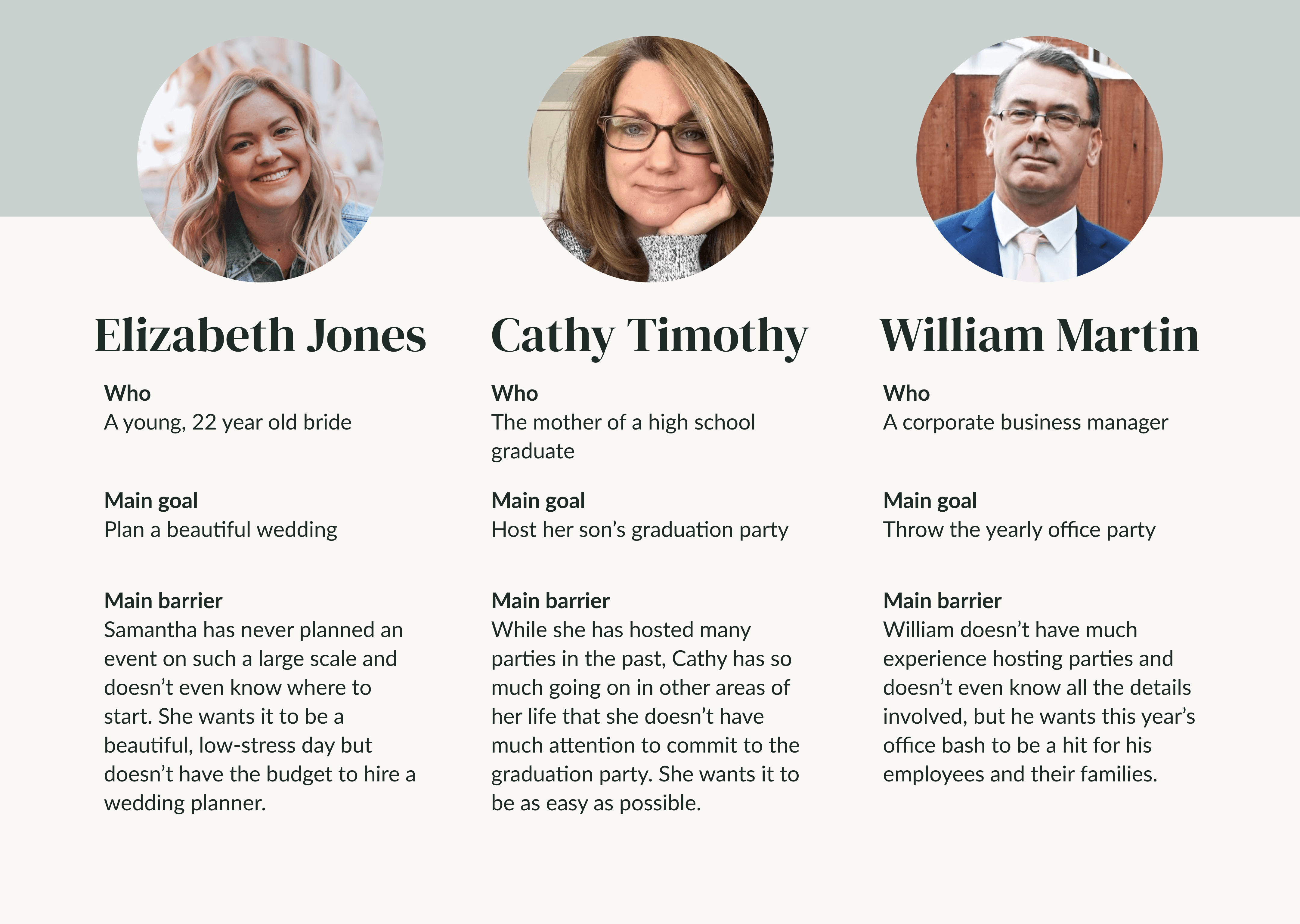
Potential Target Users
This exercise made me consider the diverse audiences my design could reach. Since party planners vary in age and experience, I aimed to ensure my final product is inclusive for all users.
Ideation
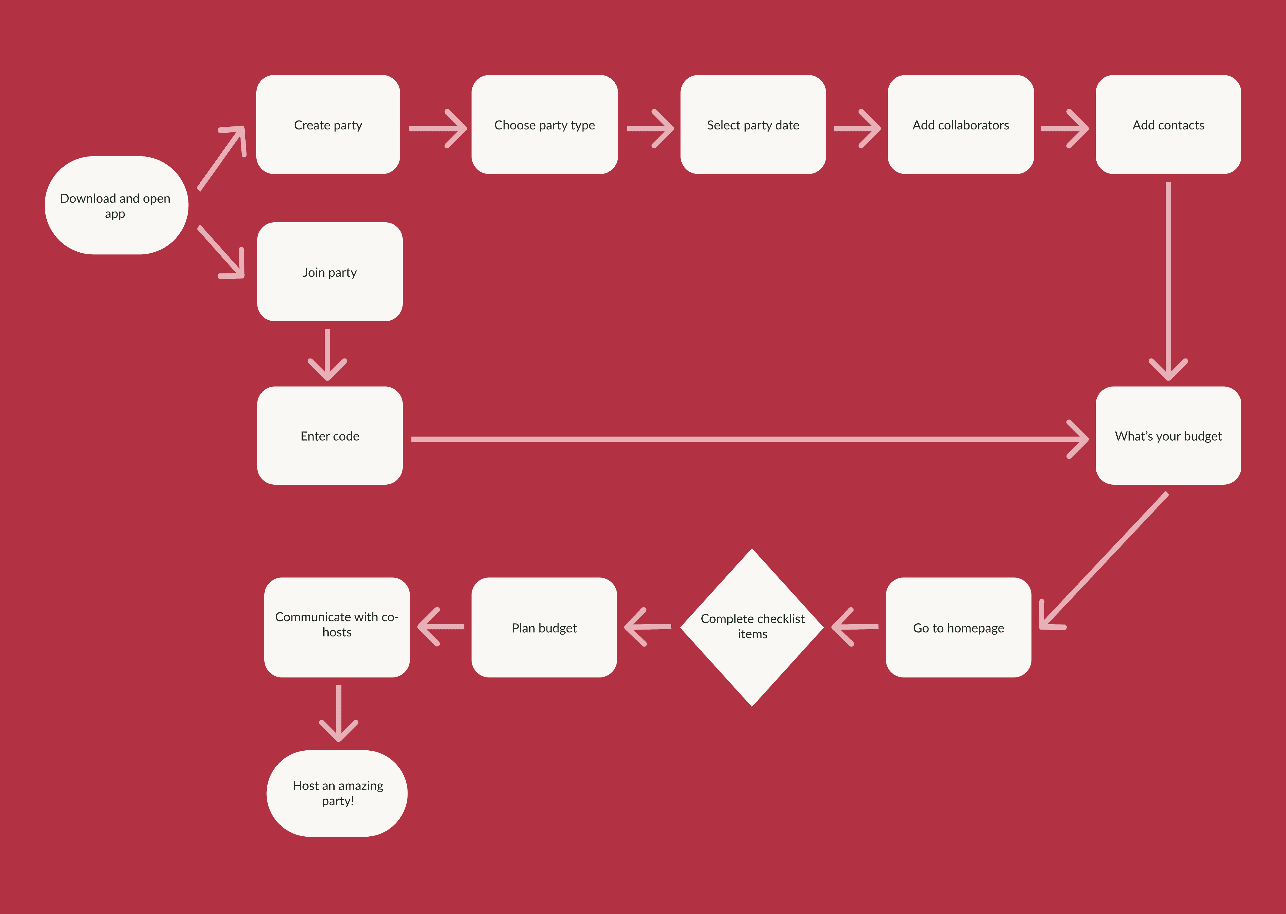
User Flow
Wireframes
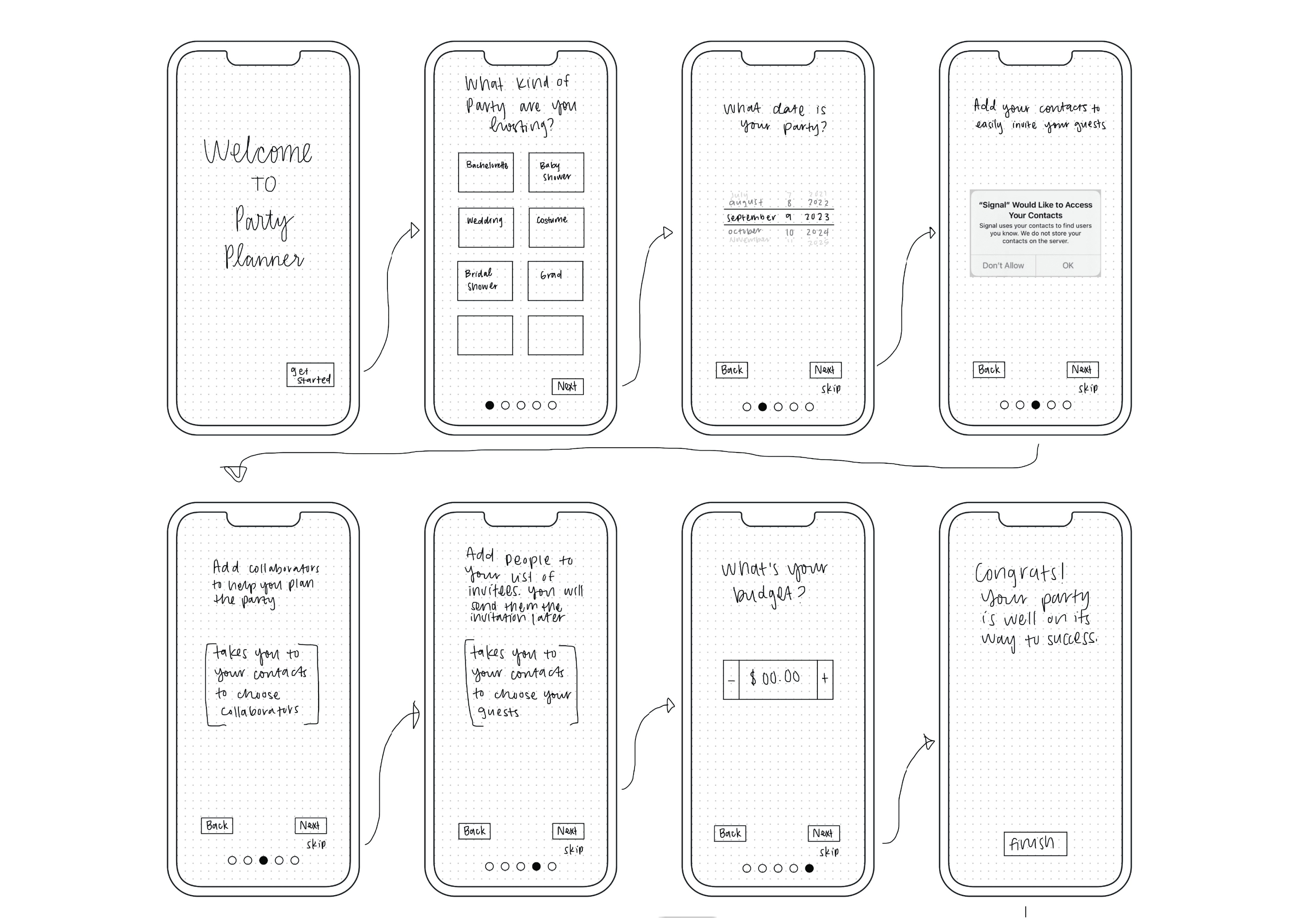
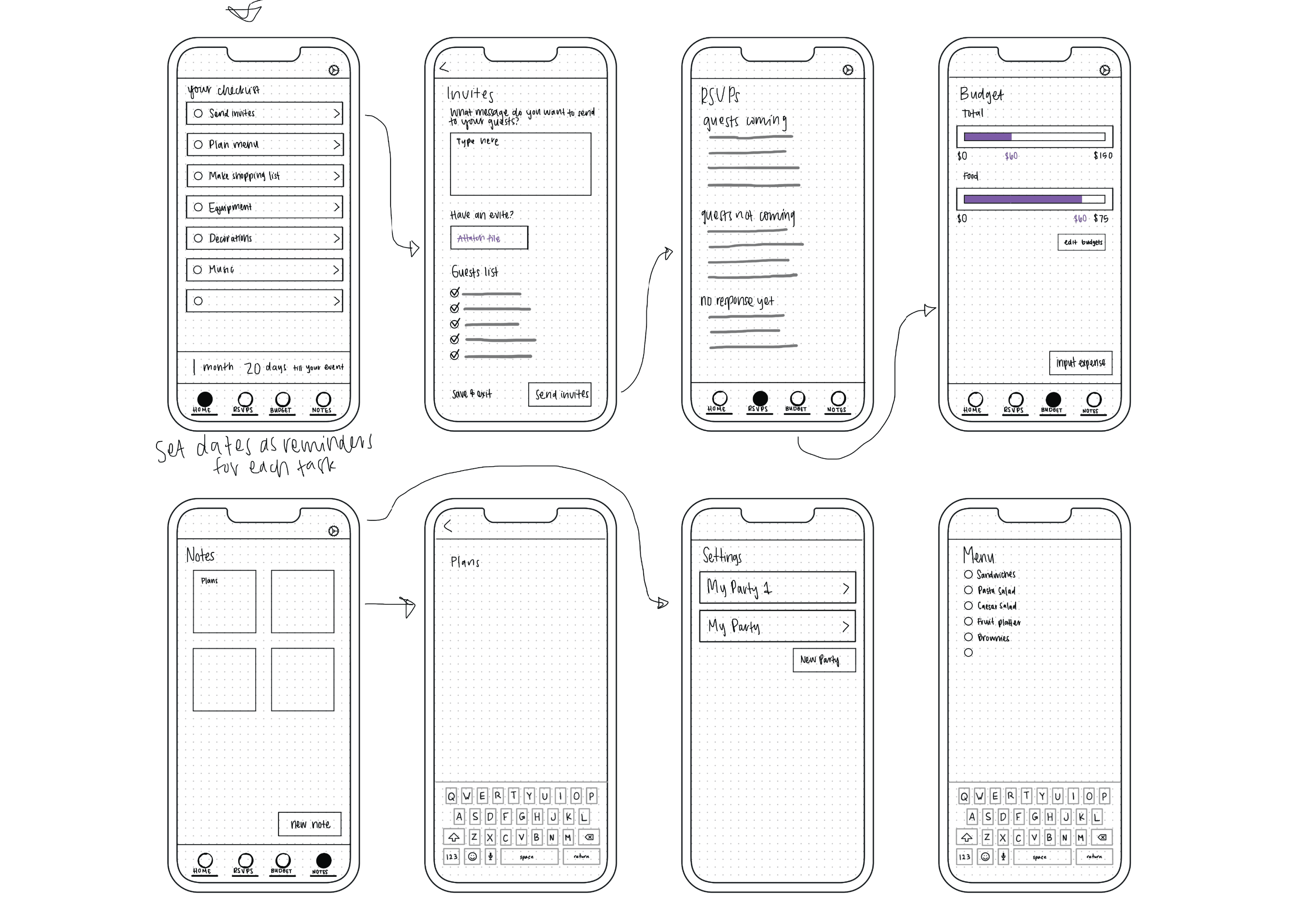
Creating wireframes highlighted the necessity of including invitation management and RSVP tracking, which was missing from my user flow but proved essential. I decided to place this feature in the bottom menu for easy access rather than as a checklist item. Additionally, I found the initial budget selection model inefficient and replaced it with a range selection feature in the final design.
User Interface Design
Name and Logo
Typography and Colors
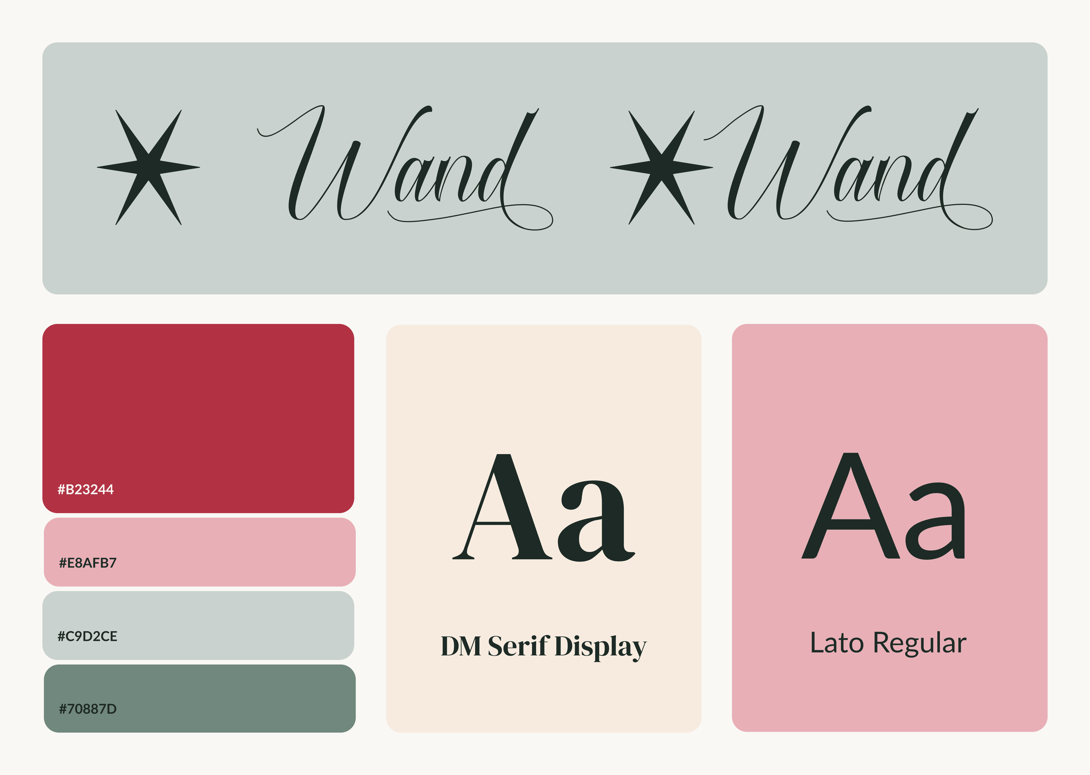
In my design, I aimed to convey sophistication, practicality, and energy. I chose burgundy for elegance and green for dependability, creating a sense of hospitality and reliability. The fonts DM Serif Display and Lato complement each other, blending refinement with functionality.
