Gestalt

A collaborative platform for designers to share work and exchange feedback.

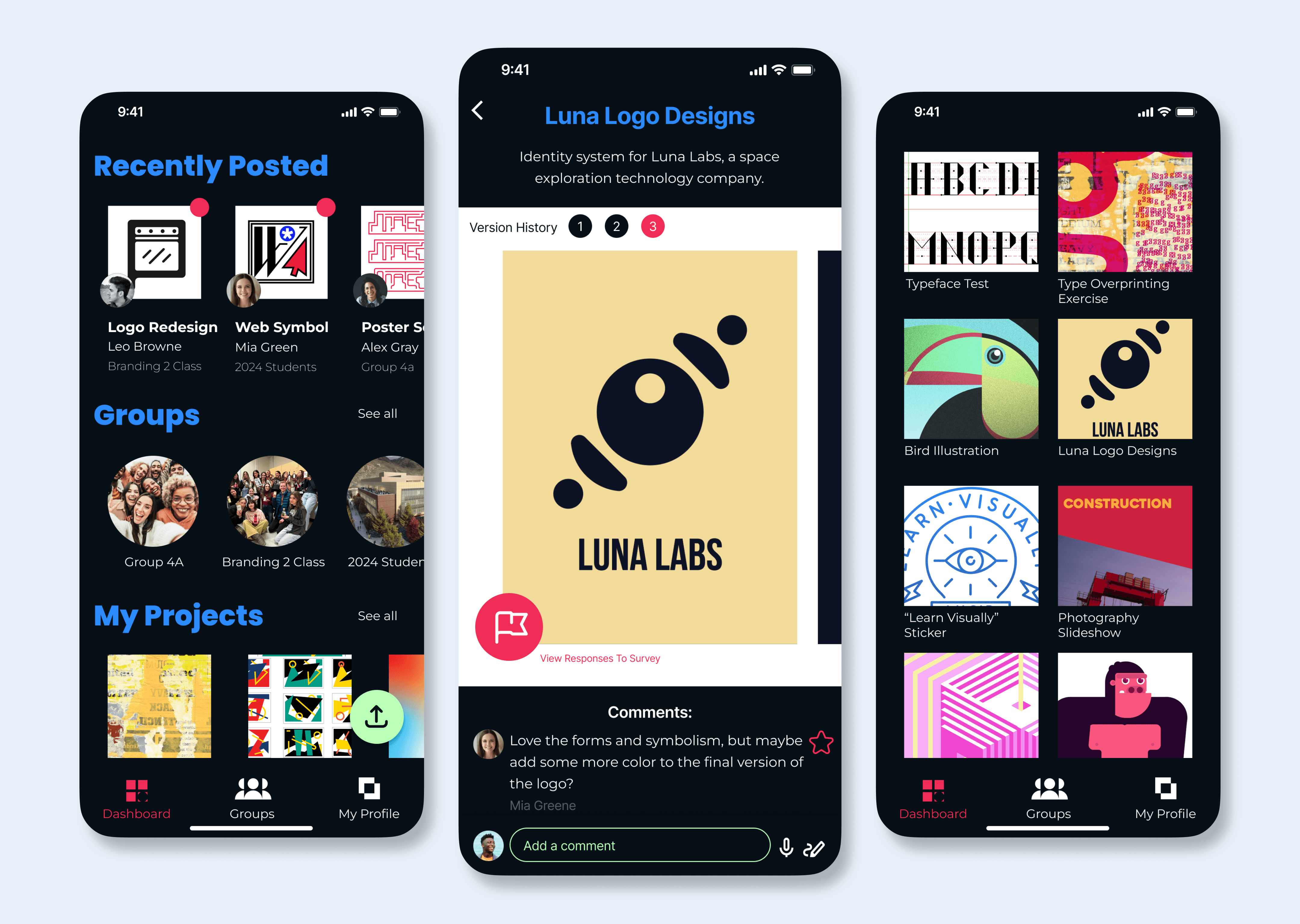
Three mobile screens from the "Gestalt" app design.

Project Overview

Project Length

3 weeks

My Contribution

  • Partial wireframe development

  • Contributed to final design elements

  • Prototype animation

Target Audience

Design students, educators, and design professionals.

Project Goals

  • Create a dedicated online space for designers to connect and collaborate.

  • Simplify group critiques

  • Facilitate workplace and educational communication

  • Provide a platform for organized, personalized design feedback

User Pain Points

  • No dedicated platform for remote design communication

  • Challenges in receiving timely critique from colleagues and classmates

  • Existing software makes it difficult to provide clear feedback

Defining the Problem

Competitive Analysis

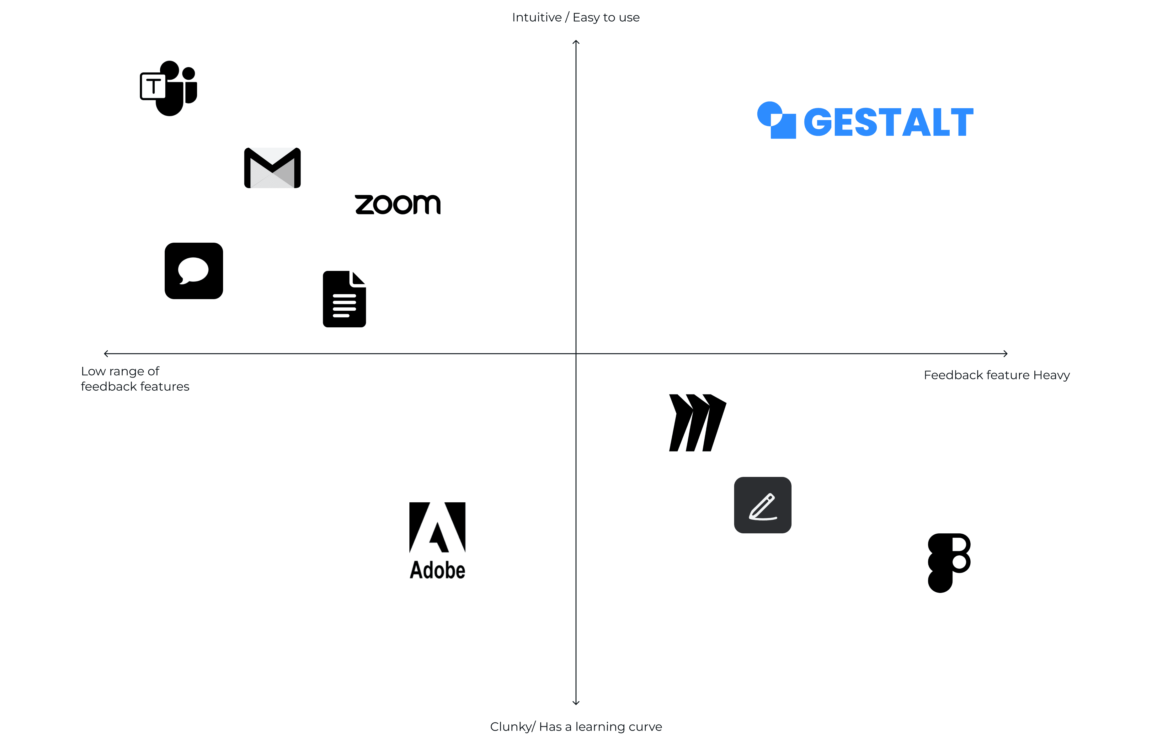
Our market research revealed a gap: existing tools offer general feedback or document collaboration but lack a user-friendly mobile interface for detailed design critique.
4 by 4 axis graph of competitors with "Gestalt" in the upper right hand quandrant.

Ideation

User Flows

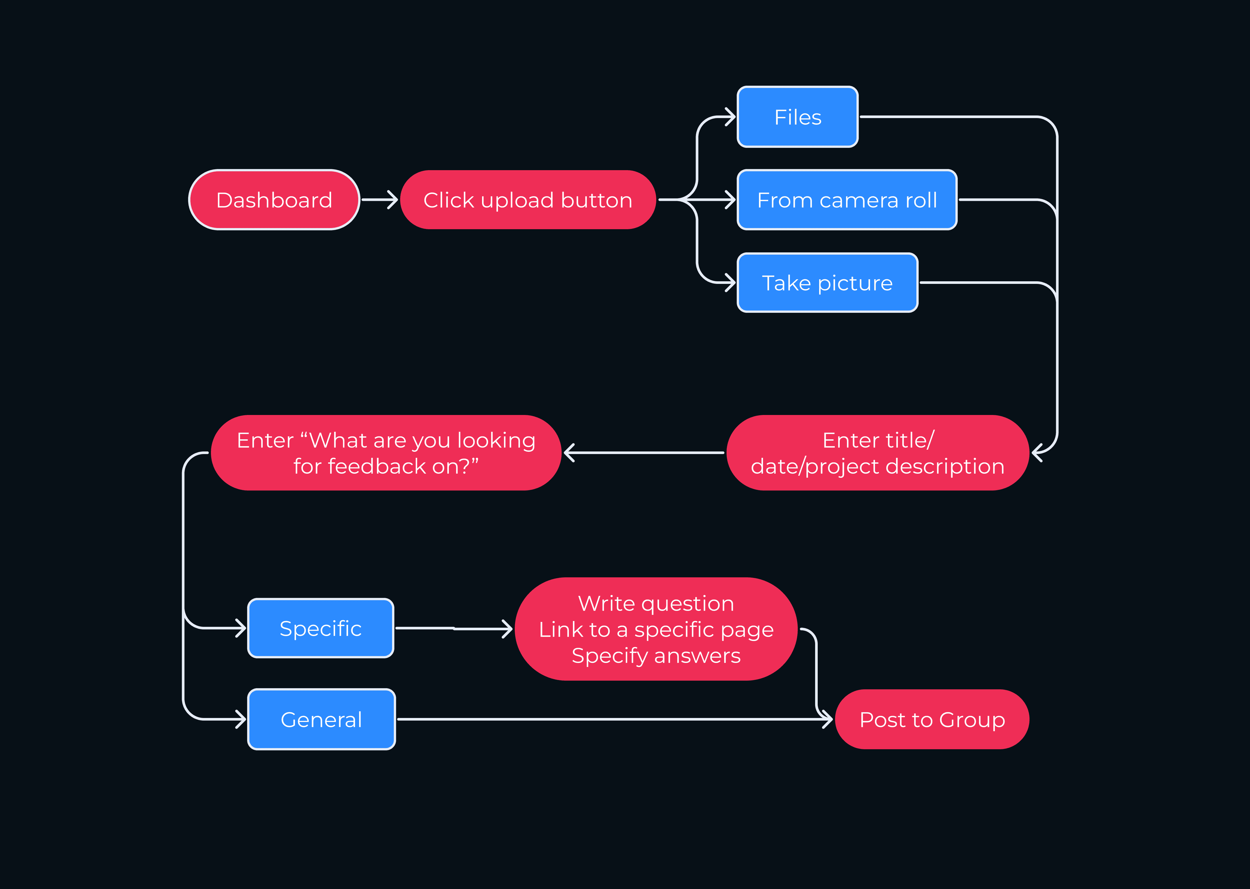
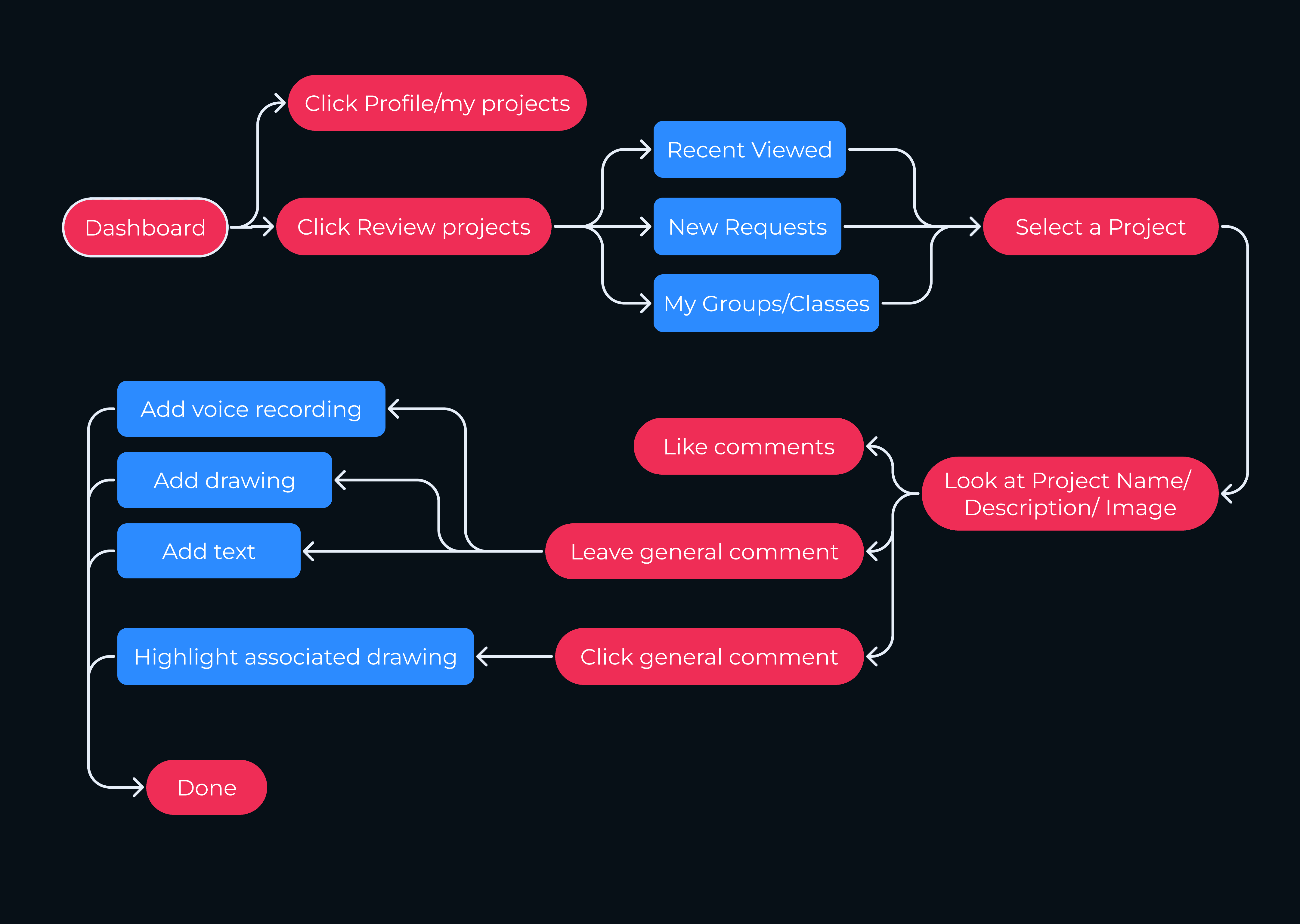
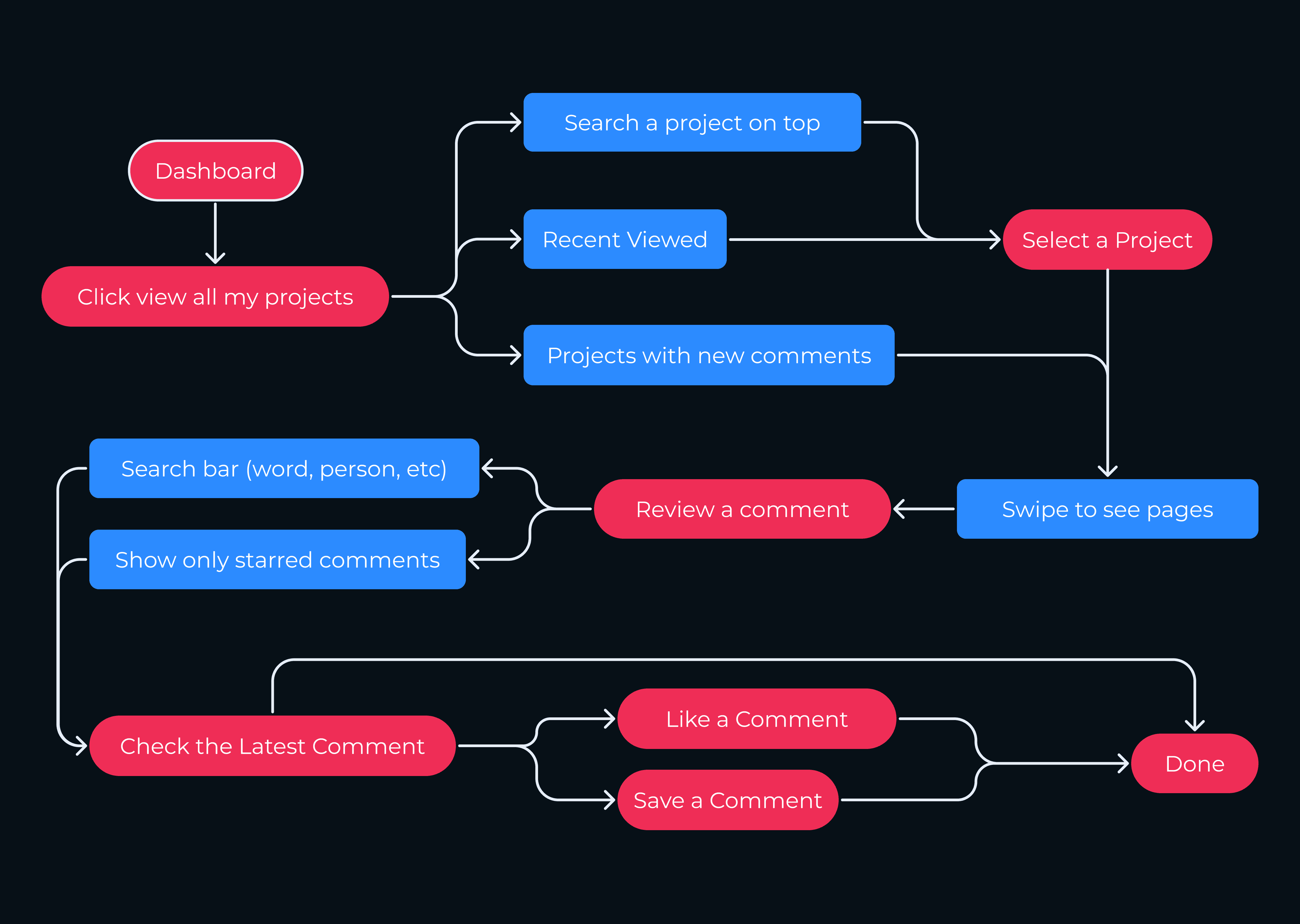
We defined three key user flows: uploading a project for critique, providing feedback on a teammate's project, and reviewing feedback on one's own work. It was crucial for users to be able to give detailed feedback on specific design elements and to provide comments for further clarity.

Upload a project

User flow for uploading a project.

Critique a project

User flow for critiquing a project.

View profile

User flow for viewing your profile.

Wireframes

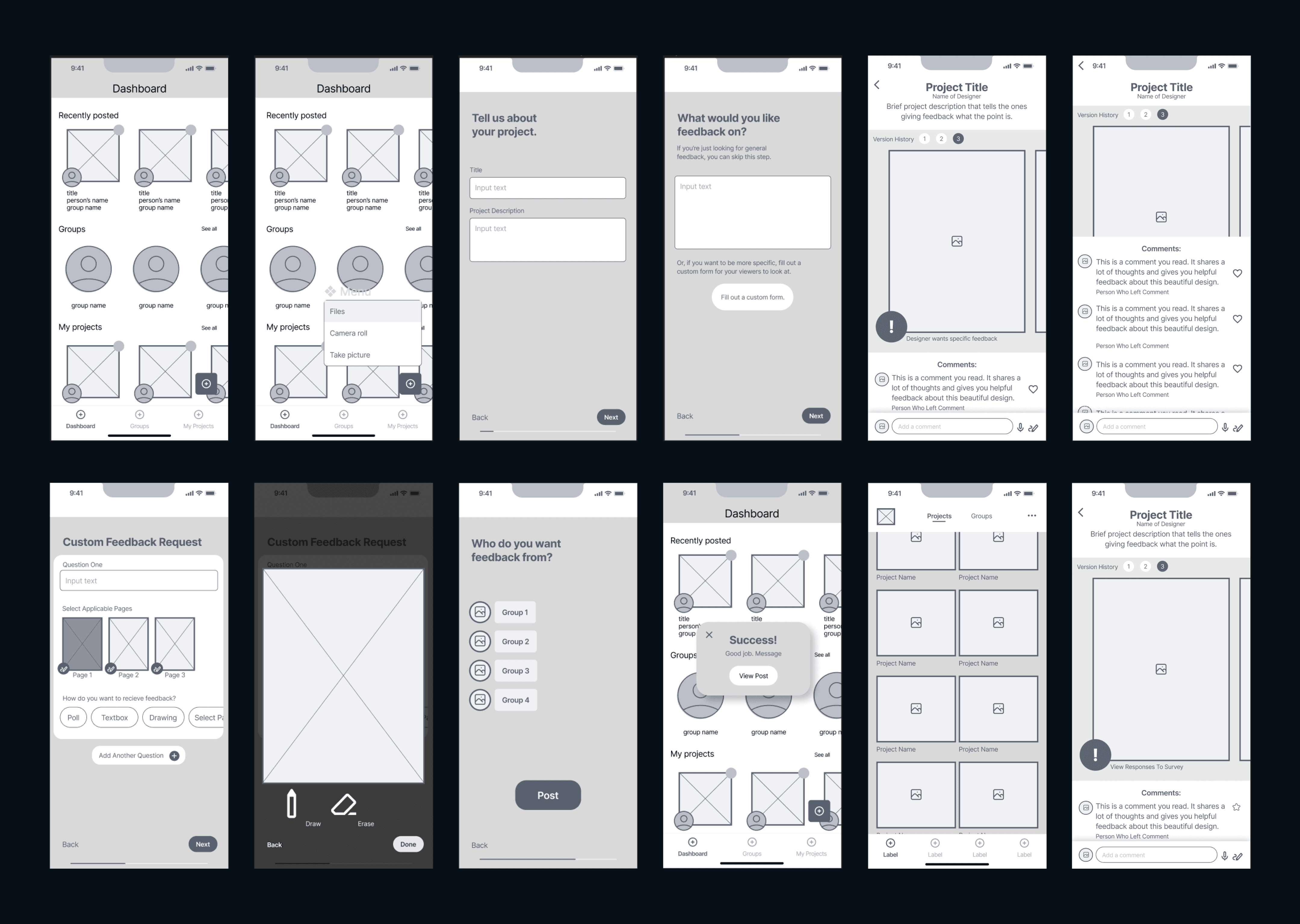
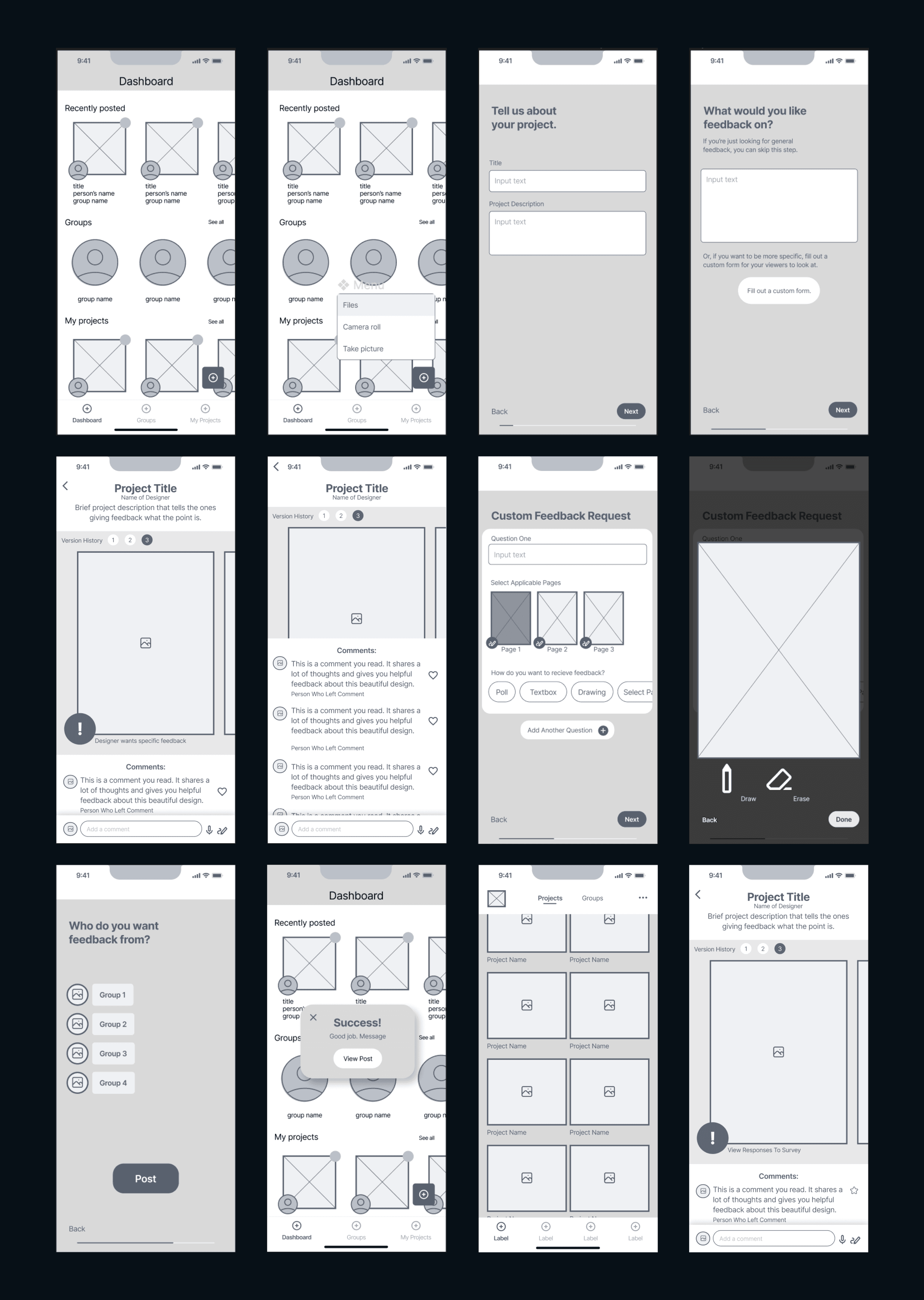
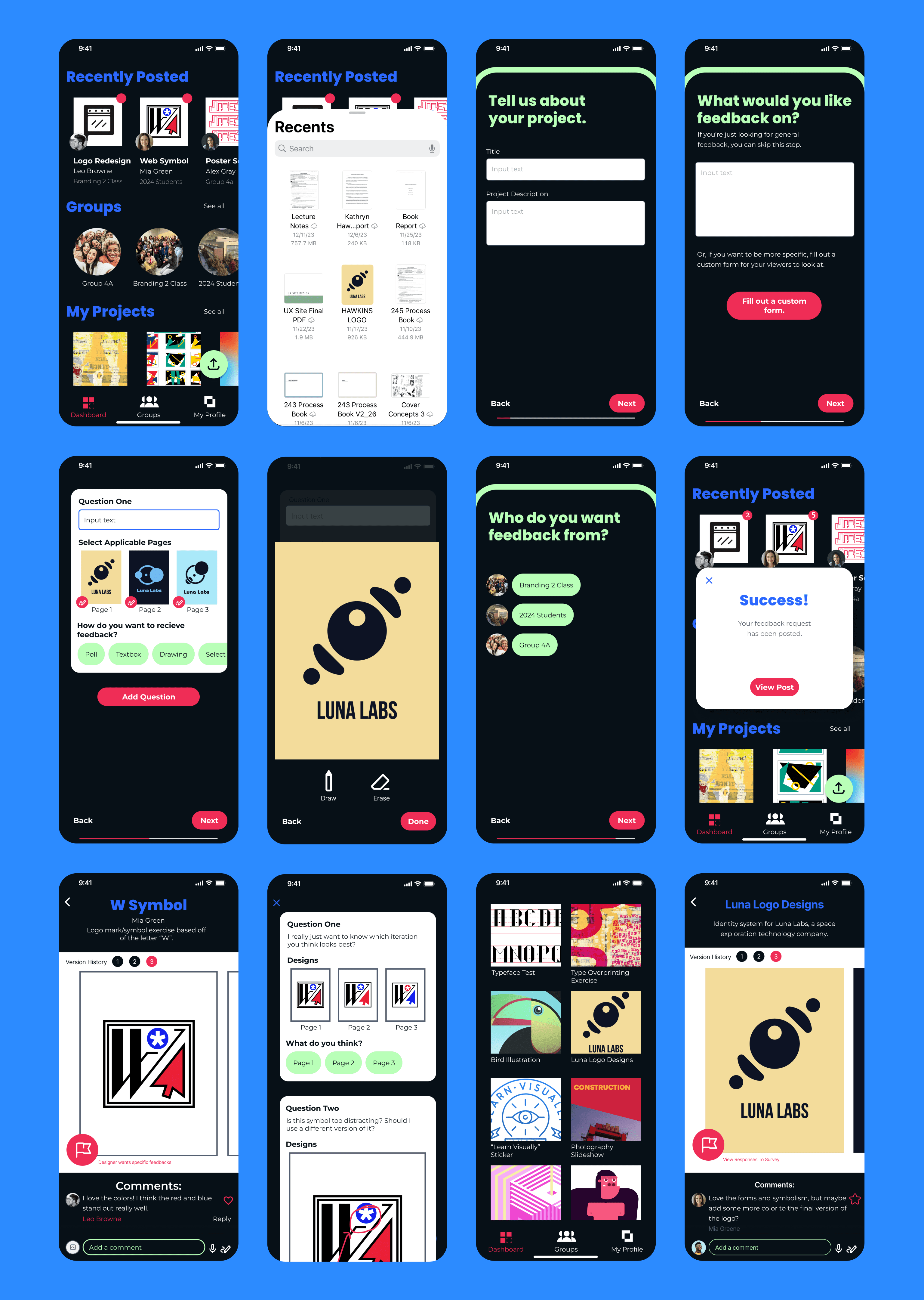
Creating the wireframes guided us in defining how to gather detailed critique information. We enabled designers to ask specific questions and select the critique format they preferred when submitting their work. Reviewers can then answer the poll, select a project page to annotate with drawings, and provide written feedback.

Creating wireframes helped me realize how important it would be to include the ability to send invitations and track guests' RSVP responses. I hadn't included this on my user flow, but it was a critical feature that users would need to frequently refer back to. Because of this, I determined that it belonged on the bottom menu and not simply as a checklist item. I also learned that the budget selection model I chose originally wasn't the most efficient style for users. I made sure to change it from a detailed toggle to a range selection feature in my final design.

12 low fidelty app design screens.

User Interface Design

Name and Logo

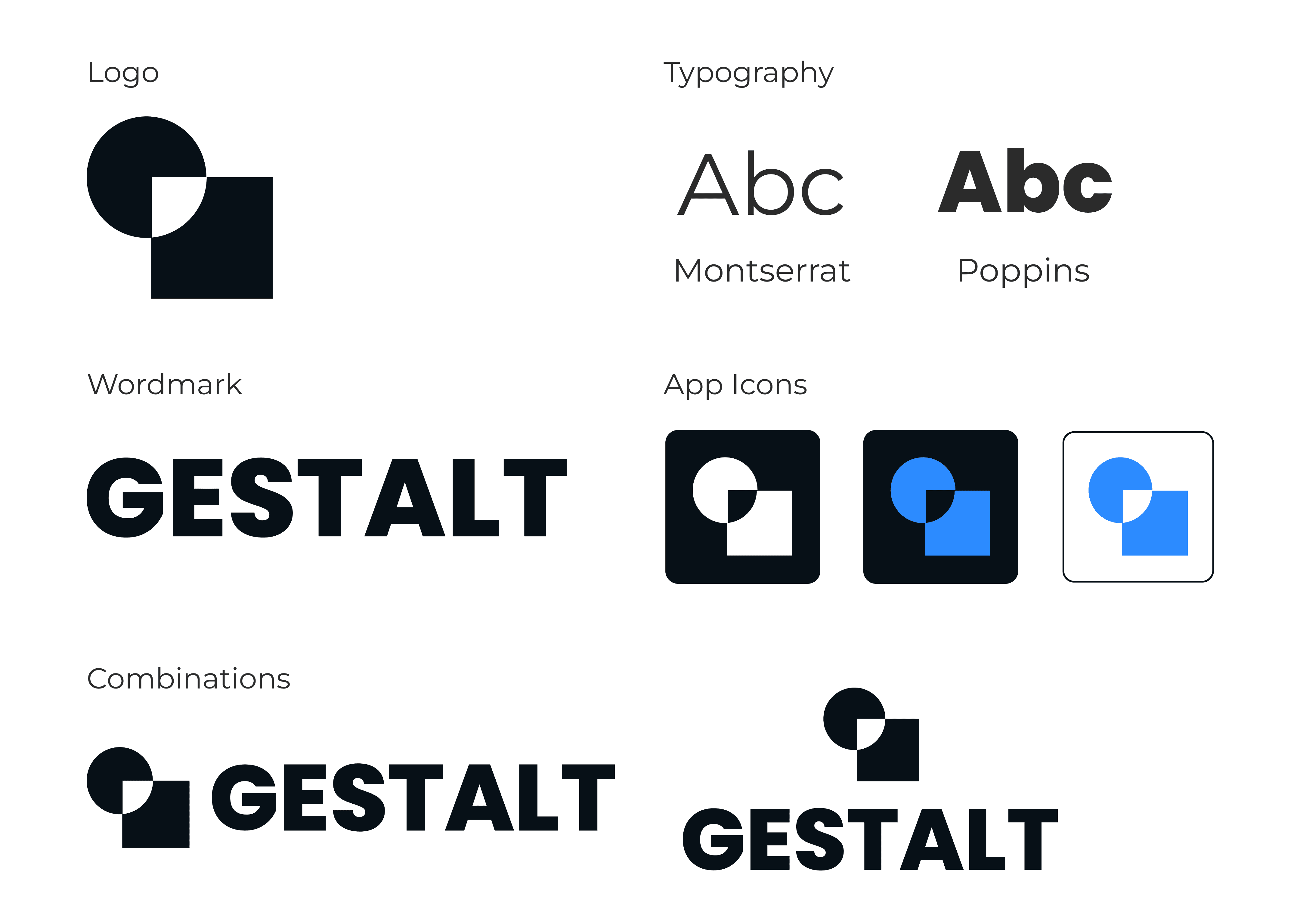
Since our app targeted designers, we named it Gestalt to reflect the fundamental building blocks of design. Our logo uses the Figure/Ground principle, featuring two black shapes with the white space forming an additional shape.

Typography and Colors

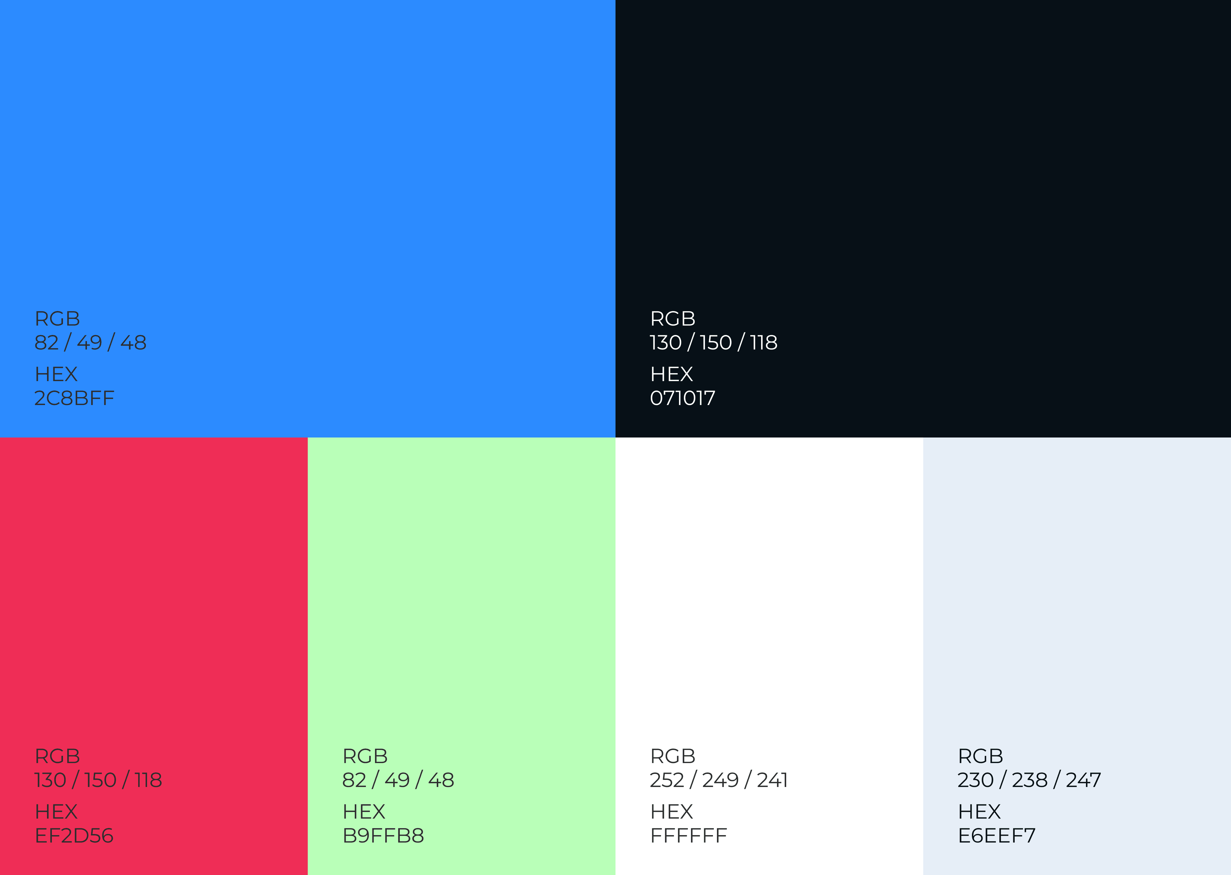
We aimed for simple, modern typography to let each designer’s work take center stage. To reinforce the theme of fundamental design principles, we selected colors based on the digital primary colors—red, green, and blue.
Brand typography and logos for "Gestalt" app.
Brand colors for "Gestalt" app.

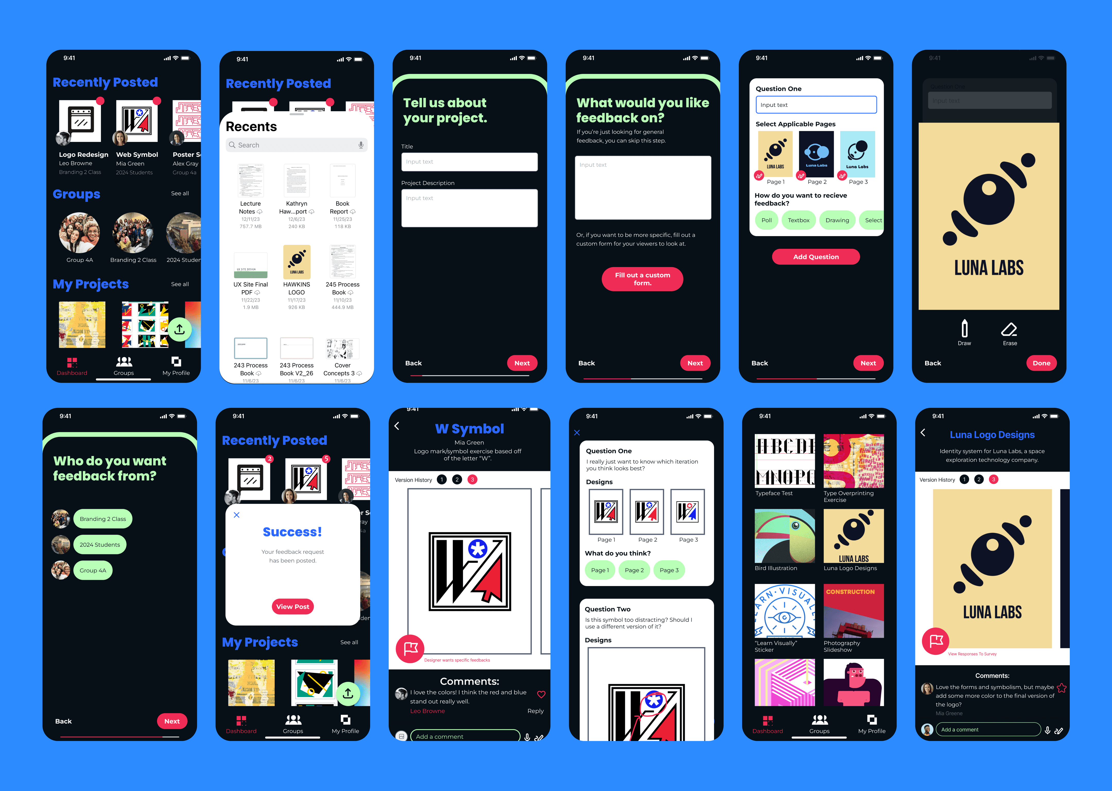
Final Design

12 final design app screens.